Environment
 |
 |
 |
 |
 |
 |
 |
‘No Global Warming for 16 Years’ - Part I
No Significant Sea Level Changes Since 1993
Christopher Monckton explains the truth of the scandal over climate change
The attendees at the recent global “climate” conference in Doha, Qatar, most of them highly influential and powerful in their home countries, were treated to a special address recently.
“There has been no global warming for 16 years (actually 18 or 19 years, on closer examination),” the speaker said. “Even if warming were to occur at the predicted rate this century, it would be many times cheaper to adapt to it … rather than to attempt, futilely, to mitigate it today. An independent scientific enquiry would be a good idea, to make sure that the conferences on the climate were still heading in the right direction.”

He addressed the conference, which had just finished hours of consultation and discussion on how to prepare for the catastrophe long predicted by Al Gore, that of global warming. “My intervention in Doha was on the spur of the moment, right at the end of the final plenary session when no one else wanted to speak,” he told WND. “The intervention gained very substantial international publicity, and I had not expected this. As a result, it is now widely known that there has been no global warming at all for more than a decade and a half.
“The fact had been concealed from the world by the news media, now largely controlled (in the West, at any rate) by the hard left,” he said. “Now the media are looking silly, the politicians are beginning to wake up, and perhaps – just perhaps – a little common sense will creep into the climate debate.
"“But it would be wise not to hold one’s breath,” he added.
He agreed recently to an interview with WND on topics including the ice cap, sea levels, warming vs. cooling trends, carbon emissions, greenhouse effect, data padding and other details.
The Question-and-Answer exchange follows:
Question: Alarmist models and charts abound, showing a dramatic increase in temperature at the end of the 20th century, the foremost being the famous “hockey stick” graph – the primary basis for global warming scenarios. Yet NASA records a significant drop in temperature over the same period. Defenders of global warming justify this large discrepancy by differentiating between “tropospheric” and “stratospheric” temperatures for the period in question. What are your thoughts about this conundrum? Why is there such a large difference between these two indices of temperature? Which analysis of the data is correct?
Answer: From 1980-2000, the stratosphere – the climatically inactive upper region of the atmosphere – had been cooling, while during the same two decades there had been surface warming at a rate equivalent to 0.17 Cº per decade. Climate extremists had tried to suggest that the stratospheric cooling was occurring because greenhouse gases in the troposphere (the climatically-active lower region of the atmosphere) were inhibiting the return of long-wave radiation to space. Their argument was that if the sun had been the cause of the warming, the stratosphere, as well as the troposphere, would have warmed.
However, around 2000 the stratospheric cooling and global warming ceased. The extremists now seldom mention stratospheric cooling as a hallmark of manmade global warming, not least because they have finally been compelled to admit that the debate is not about whether CO2 and other greenhouse gases can cause some warming (they can) but about how much warming they will cause.
Question: Studies done by Harvard meteorologists have been unable to replicate the extreme scenarios and findings of the IPCC without “data padding.” Has “data padding” obstructed public knowledge of actual temperature trends? Can you explain data padding and other statistical anomalies in global warming discussions to readers? Did the IPCC, in your view, falsify data?
Answer: Arbitrary interpolation, sometimes called “padding the data,” is a procedure by which climatologists for regions of the Earth such as the Antarctic, where temperature stations are few, fill in guesstimates of what the data would have been in various places that have no thermometer measurements. This technique was used three years ago in a now-notorious paper by various authors including Michael Mann of Penn State University, in which it was pretended that Antarctica had been warming over the past 30 years when in fact it had been cooling. It was subsequently shown that one of the main reasons for this bizarre result was improper interpolation.
Some examples:
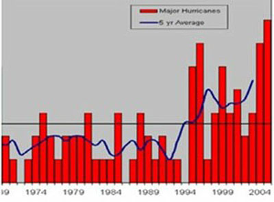
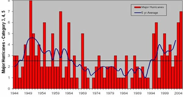
Data truncation: A scientific paper, published in the peer-reviewed literature in 2006, displayed the following graph, at right, and drew from it the conclusion that the frequency of severe (category 3-5) Atlantic hurricanes has been increasing, and that we are to blame.
However, the truth was as follows in the graph below.
Data fabrication: The publicity poster for Al Gore’s climate movie, a still from the film, showed an apparently precipitate increase in temperature in recent times. However, the graph could not have been drawn by any scientist.
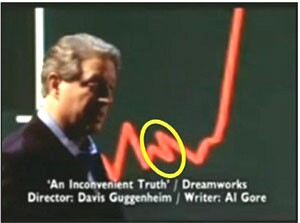
However, Mr. Justice Burton, in the UK High Court, in a very rare instance of a climate-related case that was not a sweetheart action between two publicly subsidized entities - each of which held global warming to be a global crisis - found that, particularly with reference to sea level, Gore had been exaggerating.
In his judgment, he bluntly said: “The Armageddon scenario that [Gore] depicts is not based on any scientific view.”
Graphical realignment: Officially, sea level is rising not at 20 ft. imminently but at 1 ft. per century. The IPCC’s 2007 report only predicts a maximum of less than 2 ft. per century to 2100, down from more than 3 ft. per century predicted in its 2001 report.
However, at a conference organized by the Russian Academy of Sciences in Moscow in 2004. a member of the University of Colorado’s satellite-altimetry team told Professor Niklas Mörner that the satellite data were not in fact showing any sea-level rise, even after correction for tectonic subduction, isostatic recovery, variations in length of day, etc.
Professor Mörner was told that the entire graph of satellite-altimetry-derived sea-level rise since 1993 had been arbitrarily tilted upward to show the sea-level rise that is now used as the basis for numerous papers saying it indicates a sharp and inferentially anthropogenic increase in ocean heat content. In a 2011 paper for the Centre for Democracy and Independence in the UK, he wrote:
“The fact of this ‘reinterpretation,’ which turned a near-zero trend in sea-level rise to a trend of 2.3 mm per year (later 3.2), was orally confirmed by a member of the satellite altimetry team in 2005 when I attended a meeting on global warming held by the Russian Academy of Sciences in Moscow. Exactly what was done remains unclear, as the satellite altimetry groups do not specify the ‘corrections’ they carry out. …
“The concept of the global isostatic adjustment is a model supported by some data (see e.g. Peltier, 1998) but contradicted by other data (e.g. Mörner, 2005). Global isostatic adjustment corrections have been applied to tide gauges, to sea level records, to satellite altimetry data, and now to ocean mass changes. It appears that without these corrections there is little or no room for any global sea level rise.
Correcting tide gauges for global isostatic adjustment or regional crustal movement is not the correct way of treating records of this type. Instead, each site must be evaluated individually with respect to stability, wind, waves, sedimentation, compaction, loading, and tectonics. A blind global isostatic adjustment model correction may provide quite wrong results; it is a dangerous shortcut applied by scientists who are not sea-level specialists by training and hence lack the skill to undertake careful site-specific stability analyses themselves. Fig. A shows the satellite altimetry records as presented by NOAA (2008), which suggest a sea-level rise of 3.2 (± 0.4) mm per year:
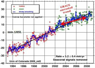
“In Figure B [below right], the TOPEX/POSEIDON satellite altimetry record of Figure A is back-tilted to fit the original trend for 1992-2000 and the raw data from the GRACE satellites … for 2003-2007.
“This gives an un’corrected’ satellite altimetry graph, from two independent sources of actual, unaltered data, showing no signs of any sea-level rise. The original record for 1992-2000 is restored … and the GRACE raw data fit the record perfectly well:
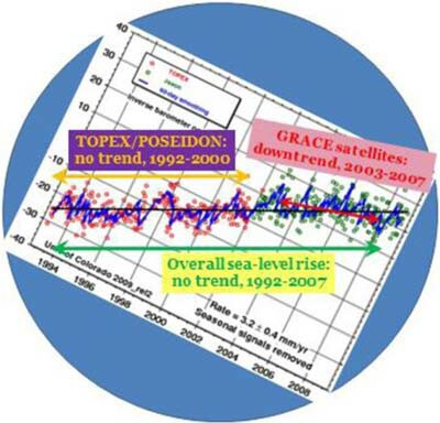
This implies that the Fig. A satellite altimetry record is significantly altered by non-technical ‘corrections’ (whatever they may be). The ‘corrections’ applied are not specified by the responsible groups at NOAA and the Centre National des Etudes Spatiales, France’s space agency. Various types of corrections may be applied, provided that they are clearly declared and described. This is not the case with the presently-circulated trends in sea-level rise from satellite altimetry (see e.g. Aviso, 2003; NOAA, 2008).
“If the ‘corrections’ applied are not clearly specified (and discussed and argued for), then the resulting corrected data cannot be objectively evaluated. It may be mere disinformation, perhaps disseminated with the intention of supporting the IPCC’s wild claims about sea-level rise” (Mörner, 2011).
During a climate conference at Downing College, Cambridge in May 2011, Professor Mörner presented results of detailed surveys by him in all parts of the world, confirming his conclusion that there has been little or no statistically-significant sea-level rise since the satellites began monitoring it in 1993. The moderator of the session at which he spoke was visibly displeased, but was not able to refute any of Professor Mörner’s detailed evidence.
Continued


Posted October 21, 2013
______________________
______________________